Shattky Optometrists
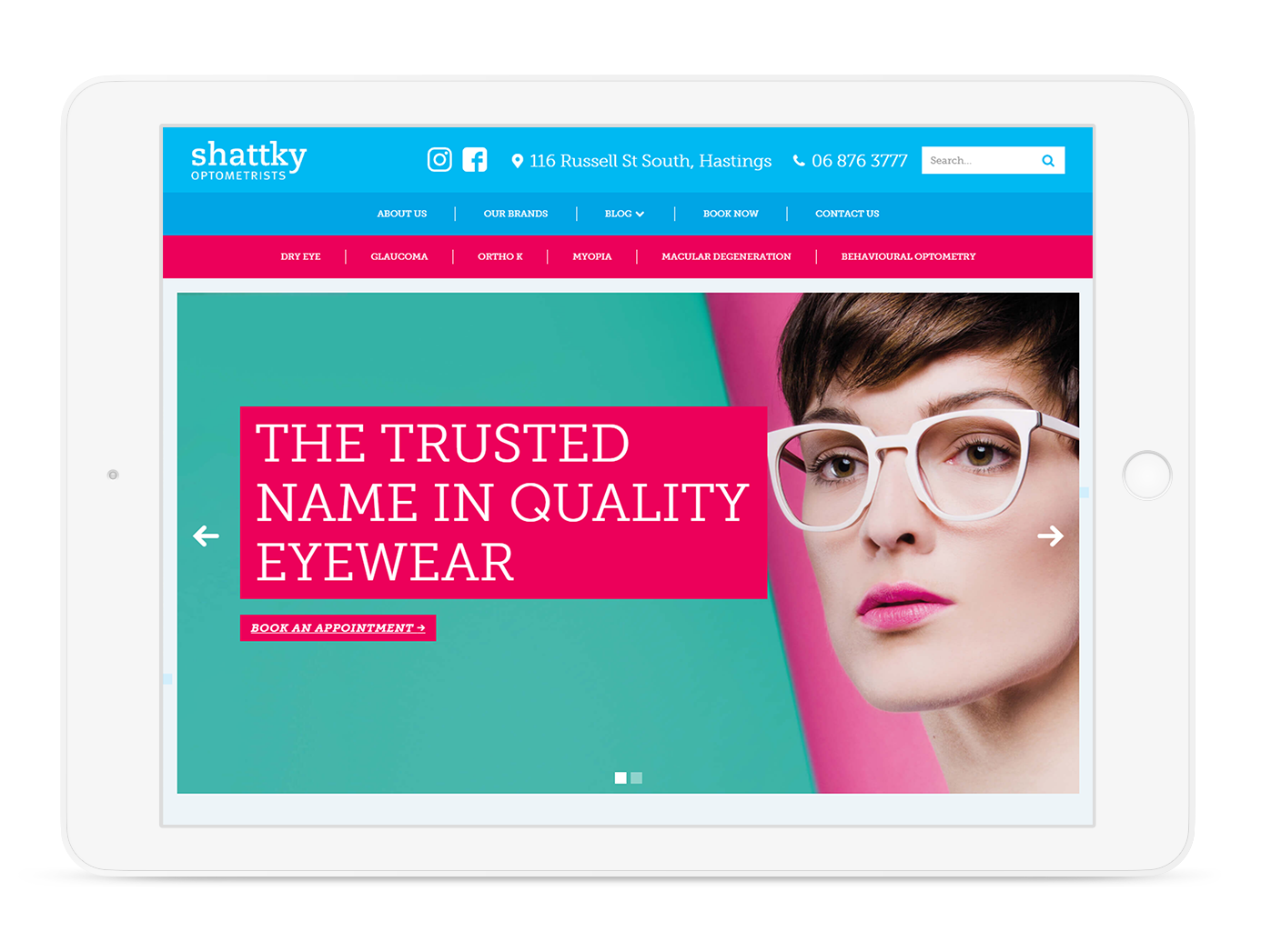
We were approached by Shattky Optometrists to do a complete redesign of their existing website, as well as the website for Vision Link. Both websites were outdated & confusing to navigate, which meant that an important part of the website redesign was to make sure that the website was structured in such a way that would make sure navigation was intuitive and straight-forward.
The old Shattky website had a lot of good content which was not organised very well, which made it difficult for visitors to the website to find. On the new website we have created a comprehensive blog system which sorts blog posts into categories, which combined with the search bar, makes it easy for users to browse for the information that they’re looking for.


Visually, we wanted to create a website which matched the level of expertise, attention to detail and enthusiasm that Tim and the team have at Shattky’s. The visual direction for the new website was inspired by the recent deisgn work that we had created for Shattky’s – including an eye-catching car wrap (which you may have seen driving around!), a bookmark and a brochure. A combination of solid blocks of vibrant colour and eye-catching photography was used across this material and the new website to elevate the Shattky brand and set it apart as something fresh, fashionable and forward-thinking.
View website here: shattky.co.nz
